Branding often ignores how design will perform in social media. These best practices will help your brand look great in the social feed.
Branding is a process. It takes into account so many things, from product features to company culture. There’s much thought put into the esthetic. Making a first impression. The color palette. That hard to nail down short, sweet tagline that says something impactful. What is not often taken into account is how the branding will translate to social media. Use these best practices in the early design stages to nail it in the social web.
Social Media Friendly Logo Design
It all starts here, with the logo. It is also the most important element to your social media branding. The logo is what people see first in a social media feed as it is most often used as the profile photo on social media pages. While a horizontal logo looks awesome in the header of a website, it wreaks havoc in social media profiles. The typical profile display that people will see most often (in feed) is 40-60 pixels square. It’s reduced to a fraction of that on mobile, which is the majority of users. Current social media stats show that a whopping 78% of people are Tweeting from their mobile device. One third of Facebook users access it with their phone. And, so on… That is not enough room to show detail or complexity in a photograph. The square format will also leave a lot of white space top and bottom of short, horizontal logos.
What works best for people profiles is a close-up headshot. Brands need a nice headshot to stand out as well. In the early design stages of your logo, make sure you have a square version and something iconic to pull out and use across different branding opportunities.
Here’s what works for brand logos in social media profiles.
A simple, square, bold adaptation.
A shorthand variation when your logo is too long.
Go iconic.
Creating Social Media Photos People Care About
I have to admit, this is one of my biggest frustrations working with designers. Photos and graphics used on website banners and branding do not translate to social media. Here’s why:
- Social media likes authentic photography that looks like it was taken by a person and a smartphone.
- Dark images do not perform well on many social networks.
- Call to action buttons used on your website banners are not clickable in social media photo uploads.
- Anything that feels like advertising does not perform.
- Things that delight, entertain, and inform perform.
- We do not need your logo repeated several times in one message. It’s already there, next to the photo, with your brand name in clickable text, in action on the feed.
- Photos with lots of text and logos overlaid annoy people. Facebook has gone as far as creating a policy for advertises that does not permit more than 20% of a photo to be taken up by text. Test a photo.
- Print flyers do not translate well to social media photos.
Print designers must become more interactive in design. Interactive designers must become more social. Here are examples spanning the good and the bad.
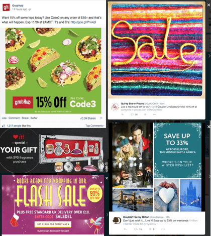
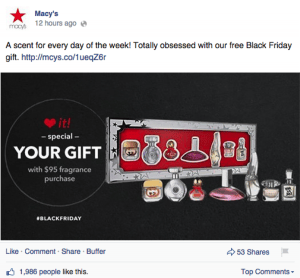
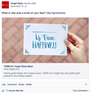
Good Social Media Photos
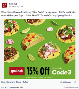
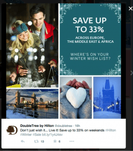
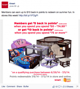
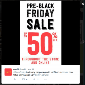
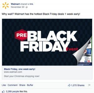
Bad social media photos.

Designing Pretty Links
Most social networks will pull information about a URL from a website and display it when sharing a link. The only social network not doing this, as I write, is Twitter. Facebook, among others, will display:
- Website page title (or SEO if it contains meta tags)
- Website page description (or SEO if it contains meta tags)
- Thumbnail photo (featured photo from a blog post)
Facebook has made it easy to make your links look pretty. You can apply Open Graph tags to each page dictating what displays. This is made even simpler through WordPress using the WordPress SEO by Yoast plugin which has an option to set information, in addition to search, for social networks. If you use a professional social media tool to manage your content, such as Sprout Social, it will allow you to re-write the information and upload a new photo. So does Facebook when posting directly through the site.
When you do not have Open Graph tags set, you are at risk of sharing, or worse others sharing, ugly links that:
- Display a poorly written SEO title and description
- Display no title and description
- Display a horrible photo that is cut off or not meant to be associated with the link
Here’s what you need to know about creating a pretty embedded URL social media post:
- Make the URL title a short and actionable headline (it is a live link people can click).
- Do not overwrite descriptions. Stay away from over explaining offers, listing everything from the page, and complexity. Keep it short and if there’s any terms and conditions in your offer, just write “click for details.” Sell them on the page not the teaser.
- Use simple, clean photography. I can’t stress this enough. The tendency is to want to overstuff the photo with more headlines, logos and the like. It will not help but hurt your effort. And, get your content blocked on Facebook.
- Keep the status update copy clever, short and sweet.
- Do not be repetitive. All of these elements work together. The name of the sale, for example, does not need to be stated in the status update, link title, and photo. Say it once. Make a bigger impact.
Did you make the fix on a previously published web page? Reset Facebook’s indexed URL tags and photo using the debugger. If this still doesn’t work and your website uses a cache system like ours does, you’ll need to also clear the cache.
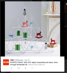
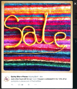
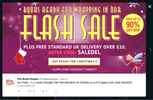
Examples of well done embedded URLs:
It’s All About Making People Feel Good
The difference is obvious. Good creative leaves you with a good feeling. (click!) The bad makes you turn away.
Whether you’re branding a campaign or redesigning a logo, be creative in how you imaging it can be used in social media. Great photography, texture, and personality will go a long way in engaging people. A misplaced button or poorly structured logo can ruin the whole experience. If you’re not sure how your branding will translate to social, set-up a private test page on Twitter, Facebook, etc. to see it in action. Attention to detail and small iterations will get your creative performing in the social web.
Bonus –Social Media Image Size Cheat Sheet
- Ideal, not required, Facebook photo upload: 700×700 pixels
- Facebook embedded URL photo: 1200 x 628 pixels (best quality) or 484 x 252 (small)
- Facebook Profile Image 180 x 180 pixels
- Twitter Profile image 400 x 400 pixels
- Twitter Banner image 1500 x 500 pixels
- Instagram: square, minimum of 300 pixels for quality
- Pinterest: just about any size, Pins are dynamically resized for display in any shape or size. Horizontal photos are least compatible. Vertical, rectangle, photos are most compatible.
Note: I rarely use bad examples of things that aren’t my own in blog posts. I do not feel good about putting down the work others are doing. The reason it is used here is I felt the concepts discussed would not be fully communicated without examples. I’d also like to point out that Kmart has improved the quality of photography on Facebook dramatically over past months, so the single example does not reflect the current state. Interactive marketing is fluid. Things change often, as does the quality of work we are all doing. I can think of many embarrassing examples… At the end of the day, we’re all doing the best we can with the resources we have. The purpose of this is to elevate everyone’s knowledge (and oh yes, to ask designers to stop sending me images with buttons). Please do not leave comments pointing out other bad examples. You are welcome to share more good examples and tactics that have worked for you. Thank you!

No Comments