You may have started seeing the new Facebook-like design that Twitter launched to all users in April. It’s more visually compelling, offers the opportunity to better showcase your brand, and allows for some new features you should be taking advantage of. Today we’re going to look at what’s new and how your brand can benefit from the new Twitter design for increased visibility.
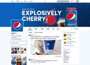
First things first. If you haven’t seen it, check out Pepsi’s profile:

New Twitter Design: What’s Changed?
1. New layout. The new layout features help bring your brand to life in a big way. They also allow for more creativity and opportunities to engage with followers. Here’s how:
- Larger banner image. This is the most obvious change to the new Twitter profile, and many are comparing it to Facebook’s timeline image. The dimensions for the larger header image is 1500 pixels x 500 pixels, and the small profile image is 400 pixels x 400 pixels.
- Profile details. The bio has been moved to the left under the small profile image, and important stats (followers, tweets, following) are now front and center under that main image. If you click on one of those stats, like “followers,” you’ll now see that info displayed in a Pinterest-like format as opposed to long list. This gives you the opportunity to learn more about the people you connect with.
2. Content highlights. The new Twitter design also features new ways to showcase your content:
- Best Tweets. Any tweets of yours that have received higher than usual engagement appear larger in your feed. This will help your customers find the content that others found most useful.
- Pinned Tweets. Like on Facebook, brands can pin a tweet to the top of their news feed (but only one at a time). To do this, hover over the tweet and click the dots at the bottom of the tweet. You can only pin one of your own tweets.
3. Emphasis on photos & video. You’ll notice that now that any photo or video shared takes up more space in your news feed. That’s because these items are the ones that receive more engagement and are what people want to see!
4. Content filtering. Your Twitter news feed now has two viewing options: just your tweets or tweets and replies. This helps customers filter out some of the chatter and just show relevant news and posts from your brand.
How Can a Brand Take Advantage of the New Twitter Design?
The first and most obvious answer is to think about what you want to accomplish with your profile page before making the switch (if you haven’t already.) If your profile still has the old look, go to the bottom of this page and “get it now”. Here are some ideas:
Like Pepsi, in the example above, showcase a new product.
Showcase a new procedure or feature, like Amazon’s new hashtag #AmazonCart shopping ability.
Share a contest or event. Budweiser is using theirs to sneak peek an upcoming event.
Promote a hashtag you want to “own”. Visa’s profile includes their tagline and hashtag.
To see more new profile designs, check out these 40 great examples.
Use more photos and videos. It isn’t a coincidence that these two forms of media now have a larger space in the news feed. It’s what customers react to, share and want to see. Twitter also added the ability to showcase four photos in one tweet! Remember to keep in mind that the entire photo doesn’t show in the news feed; it is cropped a bit. For tips on optimizing your photo for Twitter’s news feed, check out this helpful infographic from visual.ly.
Pin it! Make sure you’re pinning your best content to the top of your page, and refresh that information frequently.
Visual content just keeps getting hotter and hotter and the new Twitter profile is the latest platform to get on board with that. Your brand has many new opportunities to reach customers in expanded ways with this new Twitter design; so make sure you have fun with it!
How is your brand taking advantage of the new Twitter design?


No Comments